Monday, May 18

Revised- Vignettes and Mutations by Eric White at GRIMM Gallery


Revised Vignettes and Mutations by Eric White at GRIMM Gallery Review

Stella Kowalsky

       Vignettes & Mutations by Eric White at GRIMM Gallery is a deeply introspective exhibition by creating a feeling of partially remembered experiences rather than complete narratives. In one piece, a woman sits at a table with her face cropped and partially hidden. The viewer is placed in an uncertain position, we are close to the subject yet separated from her. Because important visual information is withheld from us the image feels familiar while also distant, like the painting of a car interior facing an unreadable billboard against a sunset which presents a perspective that feel like is uncommon in painting but more in photography. Instead of observing a clear scene, we are put in a position that feels personal, almost as if we are seeing through someone else’s eyes.

       The exhibition drew me in through its realism. They initially resemble photographs because of their precision and attention to visual detail, but after spending more time with them, they feel a lot more strange and constructed. Rather than simply documenting a scene, they create moments that seem suspended between memory and fiction. The work forces us to become aware of our own process of looking. As we search for meaning in the images, we notice details that felt insignificant at first. The paintings feel deeply personal without relying on dramatic events or direct emotional displays, emotion emerges through absence and suggestion. The spacing and arrangement of the paintings creates the feeling of moving through a series of individual moments rather than following one continuous story. Each work acts like a vignette, revealing fragments of people and environments that hint at larger stories. Details like the jewelry, cigarettes, objects on tables, paintings within paintings, and domestic interiors are clues about the lives represented in the work. These objects don’t function as random decorations they show habits, personalities, and histories of the people depicted. White is interested in how people leave traces of themselves through the objects and spaces they occupy.

      White becomes both a collector and participant within these images making a visual archive that reflects not only the people around him but also his own perspective and relationship to memory. These paintings suggest that identity can’t be fully understood through a single image or narrative. It emerges through accumulation, small details, fleeting encounters, and partial views that slowly build a larger understanding of a person and of the artist himself.


When walking through the Whitney Museum of American Art, Kainoa Gruspe’s Welcome to here—doorstops immediately attracted my attention. This piece incorporates many found objects, including salvaged stone; kiawe wood, haole koa wood, and Douglas fir; coconut fiber, plastic, and cement. The installation is composed of many small pieces, usually combining two or three materials together. For example, one piece consists of a stone enclosed within a woven rope structure, while another features a found glass bottle tied onto a brick with rope. These pieces are scattered casually across the floor, giving the installation an unfinished and organic feeling, as if the objects naturally accumulated within the gallery space rather than being carefully arranged.

The diversity of materials and the contrast between different ways of treating them add a strong sense of civilization and history to the work. It gives the impression that these objects had been used for a long time before being collected and displayed. The rough surfaces, weathered textures, and handmade qualities create a feeling that the materials carry traces of everyday life and labor. For instance, the way plant fibers are woven around the stones constantly reminds me of traditional fish traps. Another piece, in which burlap is wrapped around a stone and secured with plastic zip ties, makes me think of bundled pork sold in markets or prepared for cooking. These uses of materials evoke memories of past ways of living experiences. Although the objects themselves are simple, the combinations of natural fibers, industrial materials, and salvaged fragments create layers of cultural associations.

Considering that Gruspe collected many of these objects from golf courses, hotels, and military bases in Hawaii, the work inevitably reflects his thoughts on extractive relationships between colonialism, industrialization and the environment. Through creating these doorstops, Gruspe hopes to keep the door open for more possibilities in the future. The title itself suggests resistance against closure, as if memory, history, and cultural identity can still remain active in spite of environmental and social transformation.

The other piece that echoes this work from a distance is heʻe and leho forever / cones. It is composed of hanging translucent fabrics, shells, fishing materials, wood, and found objects. The translucent fabric is supported by a wooden frame and a piece of cement, standing upright on the floor like a fishing net. Gruspe embroiders onto this surface and attaches fossilized squid to it.

The title uses Hawaiian words: “heʻe” means octopus and “leho” refers to a seashell. These references connect the artwork closely to the ocean and to Hawaiian culture. The cement comes from Kālia, a site that was later developed into the Hilton Hawaiian Village resort, suggesting Hawaii’s colonial history and the impact of industrialization on the ocean and the land. Gruspe transforms these remnants of developed land into parts of his artwork, encouraging viewers to reconsider the relationship between land, memory, and nature. His works carry both a sense of mourning for what has been lost and a quiet hope for future possibilities.


MoMA PS1: Red Canary Song's "Touch the Heart"


by Alicia Li

A stand out piece from MoMA PS1's Greater New York 2026 exhibition, is Red Canary Song's Homeroom project: Touch the Heart. Touch the Heart, the english translation to the Cantonese phrase "dim sum", is an installation dedicated to illustrating the intimate relationships and stories about migration, autonomy, grief, and sex work. 

Touch the Heart uses the word play from its translation of dim sum in the installation. Dim sum for many migrants of the Asian diaspora, was a place of communion and cultural saftey, similar to Red Canary Song's mission. Behind the pink curtains lies four dim sum banquet tables, each dedicated towards different aspects in the worker's stories. Table I is dedicated towards grief and longing. Table II is dedicated towards migration and sanctuary. Table III towards the fine line intimacy of body care, labor, and desire. Table IV is dedicated towards providing more resources in forms of books and magazines to continue the education on the politics of sex work.

Through the haze of the sheer soft pink curtains, I was deeply moved by the attention to detail in the installation. Specifically in Table III: Body Care, Desire, & Labor, the lingering scent of tiger balm and acupunctured breast implants describe the often fetishized fine line between intimate body care and erotic power. While Red Canary Song describes some of their work to be tongue-in-cheek, I was thoroughly reminded of the many realities of asian massage and sex workers, where their likeness, lively hood, and agency have been taken advantage of. Table II also had an auditory experience, helping the installation be a fully sensory induced experience. This immersion had driven in how much the collective cares for their cause and respects their fellow community members. 

MOMA PS1 James Turrell "Meeting"


MOMA PS1 JAMES TURRELL "Meeting"

By Evan Wu


James Turrell’s Meeting at MoMA PS1 feels less like entering an artwork and more like stepping into a pause. The space is almost empty, but the emptiness becomes the main material. Sitting inside the room, the opening in the ceiling frames the sky so precisely that it starts to look artificial, almost flat, like a projection instead of something real. What interested m
e most was how Turrell manipulates perception without physically doing much. The work depends on time, weather, and the viewer’s patience. As the light slowly shifts, the sky changes color and depth, making you question if what you are seeing has always been there or if the space itself is producing it.

What I appreciate about Meeting is how it heightens awareness toward something people usually ignore. Looking at the sky is such an everyday act, but Turrell stages it in a way that feels theatrical and uncanny at the same time. The room frames a familiar experience until it becomes strangely unfamiliar. It reminded me that perception can be choreographed through subtle interventions rather than dramatic gestures. The work does not force an interaction, but instead creates conditions for observation and sensitivity. I left thinking more about slowness, stillness, and how architecture can alter the way we experience ordinary moments.

David Armstrong: Portraits Review

Artists Space

David Armstrong: Portraits


David Armstrong is a well-renowned photographer in any educational photography program. It was amazing to finally be able to see their work in person. It was really interesting to see how the exhibition was sequenced on the wall, where there seemed to be a clear distinction between the styles of the work. By this, I mean how the black and white prints were printed and framed more traditionally, with the black film bordered prints put into a white-framed shadow box, highlighting the materiality of the prints. This varied greatly from some of the other color prints, which had really massive black borders reaching back to the frame. For most of the exhibition, these forms of display were installed in the traditional manner of a straight line, semi-seperated by style, except for one wall. This one wall had all of these projects merged together, tacked to the wall in a really interesting way, creating a new way to interpret the work. This modern salon style hang started to resemble open image files on a desktop or some of the new photobooks of Vince Aletti’s archive, such as The Drawer. Together, the collage starts to change the focus of the people in the images into a collection forming an archive on queer existence. The range in printing style creates a visual timeline for audiences that may not be aware of the advancements of the artist's works, building a larger conversation of queer existence


    - Lewis James


MOMA PS1: JAMES TURRELL "MEETING"


When I visited James Turrell’s Meeting at MoMA PS1, I was surprised by how such a minimal installation could feel so immersive. The work is simply a quiet room with benches surrounding a square opening in the ceiling that frames the sky above. At first, it seemed almost too simple, but after sitting in the space for several minutes, I began to notice how differently I was perceiving the light and atmosphere. The sky slowly started to look flat and artificial, almost like a monochrome painting suspended above the room rather than an actual opening to the outdoors. Instead of focusing on an object, I became aware of my own perception and the act of looking itself.

    What affected me most was the slowness of the experience. Unlike many exhibitions where I quickly move from one artwork to another, Meeting forced me to slow down and remain still. As the daylight shifted, subtle changes in color and brightness transformed the mood of the entire room. The installation felt calm and meditative, almost detached from the energy and noise of the city outside.

    I also found it interesting that the piece contains so little physically, yet still feels emotionally powerful. Turrell uses light and space in such a controlled way that the work becomes less about viewing something and more about becoming aware of time, space, and my own presence within it.

-iAN CHEN

Friday, May 15

Review of MoMA PS1: Chang Yuchen's Coral Dictionary


Among the works in MoMA PS1, Chang Yuchen's Coral Dictionary (36 Sentences) stands out through its careful and restrained presentation. Installed as a combination of graphite drawings, coral fragments, and handmade artist books, the work initially resembles a scientific archive. The arrangement feels systematic and precise, encouraging viewers to slow down and examine the details closely. At first glance, the drawings appear abstract, but their repeated forms gradually suggest a language-like structure.

The project began when Chang collected coral fragments washed ash
ore on Dinawan Island in Malaysia. Since then, she has developed an ongoing system of classification based on the shapes and textures of the coral. The graphite drawings record the porous and fractured surfaces of each fragment with close attention, while handwritten labels and artist books suggest a process of naming and translation. Rather than functioning as scientific documentation, the installation proposes an alternative form of communication, assigning meaning through shape and observation.

What makes the work compelling is its quiet approach. Unlike large-scale installations that rely on spectacle, Coral Dictionary demands close viewing and patience. Through simple materials and careful organization, Chang raises broader questions about language, communication, and relationships across species and environments. While understated in presentation, the work succeeds in creating a thoughtful and carefully constructed system of meaning.

—Kaixin Lu

Ishana's final Review: Manuel Neri by Ruby Neri


 The Manuel Neri exhibit at the Andrew Kreps Gallery gives viewers the unique experience of seeing Neri's work through the eyes of his daughter, Ruby Neri. Manuel Neri was born in 1930 in Sanger, California. His parents immigrated to America, leaving their home in Jalisco, Mexico due to political unrest following the Mexican Revolution. Manuel attended the California School of Fine Arts and became an important member of the Bay Area figurative movement. He passed away in 2021. Because of this long history in California, Ruby Neri describes her father as being part of a kind of counterculture to the New York art scene. 

We can see the influence of post-war abstract expressionism on Neri’s work, though his interest in human figures differentiates him from the most popular artists of the time, like Pollock or Rothko. As Ruby states in the press release, Manuel Neri was “influenced by yet entirely separate from the abstract expressionism scene.” 

In M.J. Series I, Neri manages to capture emotion and movement in a still figure through texture and shape. To me, the figure’s body language feels timid or shy, as though the model was slightly uncomfortable in their pose. This slight awkwardness and imperfection is perhaps what makes the figure feel so natural. The plaster surface is heavily textured and has painterly brush strokes in blue and black across the body. The rough, almost unfinished texture of the sculpture allows us to see Neri's mind-to-canvas process. What makes the sculpture so compelling is how human and expressive the figure feels, despite having very little details to denote the facial expression. 

Neri is very sparing with his use of color throughout, using mostly primary colors and usually only featuring one color at a time against a white background. For example, Makiko III depicts a head where the nose is cut off, and blue paint is smudged over the area in its place. The exhibit is minimal and spacious in its presentation of the pieces, allowing us to appreciate the subtle textures, colors, and brush strokes. Apart from the sculptures, the exhibit also features four paintings. Window Series no. 17 stands out from the rest in that it’s an almost fully abstract piece with a much darker tone. It still feels strongly connected to his sculptures, however, because of the brushwork and the color. We can see a very abstracted form of a window with light coming in. Like the figures, he mostly uses green and primary colors. True to Ruby’s assessment of her father, even in Manuel’s abstracted work, the brush strokes feel very delicate and controlled in comparison to paintings more typical of the abstract expressionism movement. 

Knowing that Ruby Neri is an artist herself, I feel she perhaps missed the opportunity to include her own artwork alongside her father’s – even if just a few images were added to the press release – as I found myself interested to see how her own craft took shape under Manuel’s influence. Nevertheless, Ruby Neri’s love and admiration comes across in the press release, and the exhibit serves as a beautiful homage to her late father. 


Thursday, May 14

Talia Glazer's Final Review: Matt Mullican's The Universe

            From February 28 through April 11 2026 Peter Freeman, Inc housed an exhibition titled The Universe, a solo show of Matt Mullican’s single artwork of the same title. The piece, produced between 2023-2025 is a series of every image from the 1990 edition of the Random House Encyclopedia. The artist cut out every single image and chapter title and collaged them onto sheets of paper numbered in black marker with a line through the middle. When laid together the lines draw a sequential path from one sheet to the next. The piece comprises 9, 519 collaged sheets.     

            Upon first entering the gallery the viewer sees the two encyclopedias from which the images were taken. One is opened to a section titled “The Universe” and the subsequent several hundred pages are missing. In their place is straggled paper hugging the spine of the book, spindling off in shredded pieces. This is where the artist’s blade extracted each image. The book foreshadows what is to come in the exhibition, careful order marked with an edge of ruin. A table shows stacks of thousands of sheets of paper included in the series and manilla envelopes. This is a small bit of the assemblage, a preview comfortably displayed as a familiar stack of papers. 

Then, after crossing the threshold of the partial wall in the gallery’s entry way, the viewer is confronted with an expansive, high ceiling room covered in images. The sheets of paper line every inch of the walls, are displayed across a platform in the center of the room, half walls, bulletin boards, only broken by windows and columns permanent to the space’s architecture. The sheer volume immediately imparts a feeling of megalophobia. The viewer is made to feel small in comparison to the grand, all encompassing nature of the immersive piece. Mullican has essentially made tangible the feeling of how insignificant one is in the scheme of the entire universe by overloading the viewer with visual information. One is overwhelmed by the scene, but eventually the eyes focus on a piece of the assemblage, and the order begins to become more clear. Thematically linked images are ordered together, and upon following the lines the viewer rests on a title introducing the next series of images. The numbers on the tops and bottoms of each page are in sequence, letting one know where in the grand scheme of The Universe they are looking. It would be impossible to see the entire thing as many pictures are high above the sightline. 

Each image is closely cropped so the image stands apart from context backed only by white, creating a strong sense of uniformity in isolation. Topics from art to science to politics are organized but entirely cluttered together in covering every inch of space. One is not imparted with actual encyclopedic knowledge as much as with a staggering feeling that there is an oversaturation of information. The entire piece functions as a systematic, highly ordered act of chaos and destruction.


Nicole Bunis Final Review - Ceija Stojka: Making Visible


The Drawing Center’s
Ceija Stojka: Making Visible features over sixty artworks by the Roma artist in her first comprehensive retrospective in New York. The work spans the two and half floors of the SoHo gallery. The gallery walls alternate between deep purple and white which provides a nice backdrop for Stojka’s vibrant color choices. Stojka received no formal training as an artist. The exhibition has a greater impact thanks to the inclusion of Stojka’s journals and sketchbooks on the lower level of the gallery. There is also a large timeline detailing the chronology of Roma history which tracks the growing persecution they faced as Hitler came to power. These archival pieces offer an intimate look into Stojka’s artistic process and her personal reckoning with her trauma. 


Stojka’s artwork shines a light on the often overlooked and untold story of survival and resilience among Romani Holocaust survivors. The artist herself survived multiple concentration camps including Auschwitz, Bergen-Belsen, and Ravensbrück. The exhibition features paintings and sketches that encapsulate life before and after Stojka’s family was deported from their hometown of Vienna and forced into concentration camps. 


The introductory text reveals that Stojka did not start painting until her late fifties, when she picked up a paintbrush with her granddaughters. So many years after her internment, Stojka turned to art as a therapeutic act of processing past trauma and bearing witness to moments of persecution that history has largely left untold. 


One painting titled Auschwitz, 1944, is a perfect encapsulation of the duality at the heart of Stojka’s work. A field of green is dotted with purple flowers; in the distance a smokestack pours clouds of gray and black smoke across a cloudy gray-pink sky. A flock of large birds move across the sky and in the right corner there is a guard tower with an inscription that reads “Auschwitz, 1944” in white letters.The scene is at once peaceful and deeply unsettling. 


Stojka’s artistic style evokes a haunting children’s-book quality. Much of her work taps into memories from a childhood spent in unimaginable circumstances. Stojka was only nine years old when she first entered the camps. The bright colors, loose brushstrokes, small stick-like figures, and animals take on a monstrous quality within the context of the camps. The artist’s decision to paint on cardboard suggests a sense of urgency to paint these scenes as quickly as possible. These images and stories of survival demand to be painted immediately no matter the material at hand. 


Running through it all is Stojka’s fierce pride in her Roma heritage. This is visible in her scenes of life before the German invasion of Austria in 1938. Fields of sunflowers which are a symbol for Roma people, are a beautiful reminder of the artist’s unshakeable optimism in spite of the horrors she endured. Stojka’s paintings force us not to look away from the atrocities of the past while presenting moments of quiet beauty in spite of the devastation. The exhibition runs from February 20th to June 7th, 2026 and should not be missed. 


Ksenija Carleton Final Review of 'The Adventure of Domenico Gnoli' (Lévy Gorvy Dayan)


In early April of 2026, when walking past New York’s Lévy Gorvy Dayan gallery, one could easily find themselves face to seed, with the inside of an apple. From March 18th to May 23rd, Lévy Gorvy Dayan’s stone façade was decorated with a banner, advertising the gallery’s retrospective on Italian artist Domenico Gnoli, that showcased the interior of a quartered apple. Evoking a yonic shape, the sexual suggestiveness of the cut apple is increased by two brown seeds, which are perched in the upper quarter of the fruit. Although the painting referenced in the show’s banner (in which the entirety of the apple is displayed) is far less erotic, it nonetheless prepares us for the contained intimacy that constitutes a throughline throughout Domenico Gnoli’s work.

Domenico Gnoli was born in Rome in 1933. His early career in illustration, then costume and set design, ostensibly inspired the great attention to detail, and interest in the physicality of objects that characterized his painting from 1964 onwards. The works displayed at Lévy Gorvy Dayan span from 1956 to 1969, with the first floor of the gallery showcasing Gnoli’s later paintings. The show opens with Striped Trousers (1969), which depicts the upper half of a pair of worn pin-striped pants, spanning from the pants’ top hem to a few inches above the knee. The pants are displayed against a dark gray background, and appear to be floating in indistinguishable space.

Striped Trousers is an introduction to Gnoli’s consistent interest in material and texture that characterizes the following works displayed on the first floor. Other paintings include similarly zoomed-in images of isolated objects, such as an armchair, an apple, a brick wall, and the back of a painting. In the central room of the second floor, the gallery displays the artist’s early illustrations, preparatory sketches, and photographs of him in the studio. The room in the gallery’s southern wing exhibits a group of paintings that all depict variations of a bed. Some are unmade, some inhabited, and others neat and seemingly untouched.

L’inverno (Couple au lit), 1967, encapsulates the artist’s play with intimacy and distance particularly well. The painting shows a couple, whose intertwined bodies are silhouetted under the blue paisley sheets of an off-white double bed. Peeking through the covers, only the tops of their heads are shown. The point of view is zoomed in to the point that the bed itself spills beyond the canvas – the limits of which crop the pillows at the top of the painting, and the couple’s feet, at the bottom. Yet the visual proximity with the couple creates no sense of intimacy with the viewer. Rather, by hiding the couple from our view and emphasizing what we cannot see, Gnoli establishes an uncanny sense of distance. The perspective also intimates the bed-spread with the flatness of a canvas, onto which Gnoli conducts a pictorial exploration of color, shapes, and shadows.

Indeed, through his masterful investigation of texture, Gnoli tempts the viewers with an intimate foray into the materials of everyday objects. He depicts the everyday at a closeness that would be impossible to replicate in the real world. Yet ultimately by getting so close, Gnoli oxymoronically paints the eerie alienation of material culture in the modern world.     

Ksenija Carleton

The Cats and the Rats (Dean Millien) Review by Janine Olshefski

 The Cats and the Rats (Dean Millien) PS1 Moma. Queens, New York

Janine Olshefski 


Surrounded by the modernistic pieces that inhabit the MoMA PS1, the work The Cats and the Rats by Dean Millien stands out and gives the space a breath of fresh air. During my visit to the museum in Queens, New York, I found the layout frustrating at times because it was slightly difficult to navigate, and when I did come across artwork, I felt little to no emotion towards it. Most of the artwork shown during my visit felt very repetitive, which is why, when I came across the work by Dean Millien, I felt a sense of relief.

My initial feelings were joy and excitement. I enjoyed the skillfully sculpted aluminum foil figures and the narrative at play between the aluminum foil cats and rats. As I kept looking, I became even more intrigued and wanted to read about the work itself because it’s not every day that you see an artist use such a basic household item as their main medium.

After reading the plaque on the wall, it became clear that the reason Millien chooses to use such a juvenile medium is because that’s all he knows how to use. He explains that in his youth, his father took away his toys because they were too loud, so he was forced to build his own fun. While it saddened me to read this, I was able to develop a greater appreciation for both the art and the artist by viewing the work through a different lens.

Tuesday, April 28

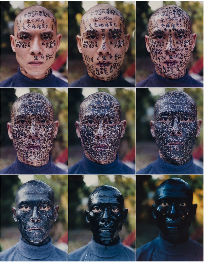
Review of “Zhang Huan: Ash Paintings and Performances” at Pace Gallery (Group A)

Zhang Huan: Ash Paintings and Performances at Pace Gallery exhibits Zhang Huan’s work as an immigrant from China who moved to New York and eventually returned to China. His work is divided into two sections. The first section presents Zhang Huan’s large-scale realist scenery paintings made of ash on linen. The ash collected from Buddhist temple incense burners reflects the artist’s religious faith in later years. 

The second section documents the nude performance art that made Zhang Huan famous during his years in New York. My America (Hard to Adapt) shows the artist sitting nude while sixty other nude people throw bread at him, symbolizing a new immigrant’s difficulty of adapting. Family Tree consists of nine photographs in which calligraphers write traditional names and fortune-telling words in Chinese characters on his face until his face is completely covered in ink, reflecting his inability to recognize people’s cultural identities after encountering the West. 

While nude performance art may be more acceptable in the West, it was still shocking to see it from an East Asian perspective, where people in general tend to be more conservative. It was also not easy for him to shoot these performances, for which he was repeatedly arrested for doing so, according to his biography. Yet as a first-generation Chinese immigrant, it is completely understandable to see Zhang Huan’s discomfort upon arriving in a new country; his work captures that experience vividly.


Chromogenic colour prints. A man with a shaved head stares at us with names and stories written on his face in black ink. In subsequent photos additional writing is added until his face is entirely black.

Monday, April 27

4/10 Vignettes and Mutations by Eric White- GRIMM Gallery

Vignettes and Mutations by Eric White at GRIMM Gallery Review

Stella Kowalsky

     Vignettes & Mutations by Eric White at GRIMM Gallery is fragmentary, intimate, and introspective. White’s paintings in this exhibition seem to represent a sense of obscured memory. The image of a woman seated at a table, cropped so that her face is partially hidden, positions the viewer as both participant and outsider. We grow more and more confused and enthralled with this woman in the scene she dominated. Similarly, the car interior shows an unreadable billboard against a sunset, through a perspective that is rarely depicted in painting.

This exhibition pulls me in so much as a photographer because of its realism. They look so much like photographs but I don’t think a camera could replicate them, it feels like only something the direct eye can see. It makes you step back and really analyze what you are looking at, and why you were granted access to it. It feels deeply personal without outright depicting events that would inflict or represent deep emotion. 


       The spacing creates smaller mini galleries rather than one big one. Every painting illustrates a person and things that reflect their personality and lifestyle. There’s a lot of colorful jewelry, paintings within a painting, cameras and cups, ceramic cats, records and cigarettes. It makes you think about how Eric has lived his own life, how he views the people around him and how they’ve impacted his view of the world. Only small details of someone’s true physical identity is shown. The artist becomes both a collector and collected, creating an interesting and very self aware archive.


3/6 Joan Semmel in the Flesh- The Jewish Museum


Joan Semmel in the Flesh at the Jewish Museum Review

Stella Kowalsky 

      Joan Semmel in the Flesh at The Jewish Museum has probably been my favorite show we have seen in this class. Each painting feels like a specific and intimate surveillance on the female identity in a way that I’ve never seen before. Specifically Sunlight really caught my attention. We look down onto a relaxed woman whose body fills nearly the entire composition, which is cropped in an almost uncomfortable way. We see intertwined legs, arms, and the curve of the torso, but very little context about the environment around her. This framing creates an intense but intimate perspective, as if the viewer has intruded on that moment but not in a scary way. Her posture suggests a moment of breath, lack of stress and awareness of anyone seeing her. Her body isn’t staged for anyone’s enjoyment but it’s beautiful nonetheless.   


       The choice of realism, the warm tones of skin in every piece, textures of folds of fabric, and the relaxed but vulnerable postures emphasizes a moment of rest in every scene. Because the viewer is in such a close and dominant position, they become ambiguous of whether or not we are truly intruding, or being welcomed into the moment. I think each painting does a beautiful job at evoking peace and comfort. As a woman, I really haven’t seen us represented in this soft way but I think once it is through a female artist's lens it really does change how we treat our own bodies.


Wednesday, April 22

Deborah Bell Photographs: "Marvin Lazarus, Portraits of artists 1950's-60's"

     Walking into the gallery, I was met with a grid of perfectly aligned, framed photographs, each a black and white portrait. At first glance, the uniformity felt almost clinical, but a closer glance revealed something far more intimate: familiar faces. These were the artists of the Abstract Expressionist and Pop era. Abstract Expressionism happens to be my personal favorite era of art history. Figures such as Hans Hofmann, Joan Mitchell,  and Robert Rauschenberg appeared not as distant icons, but as individuals grounded in their own spaces.

       Each portrait captures the artist within their studio, surrounded by the tools and environments that shaped their work. There is a quiet honesty in these images. An unguarded quality that resists romanticizing. Instead of presenting the artists as larger-than-life figures, the photographs offer a sense of accessibility, as if granting viewers a brief entry into the artist's world.

    The self-taught photographer, Marvin Lazarus, began this work through an unexpected path. Originally an attorney, he was inspired by the idea of New York as the undisputed center of the postwar art world. Determined to document the artists who defined this era, he left his legal career behind to pursue photography full-time. As he visited each studio, he documented his experiences and impressions. Over the course of the project, he visited and photographed 37 artists' studios/lives. His work serves not only as a documentation but as a bridge, bringing viewers closer to the people behind a pivotal movement in art history.


Monday, April 20

Review of "Irriṯitja Kuwarri Tjungu: Contemporary Aboriginal Painting from the Australian Desert"

NYU’s Grey Art Museum’s exhibition of Australia’s “most iconic Aboriginal art movement” titled Irriṯitja Kuwarri Tjungu: Contemporary Aboriginal Painting from the Australian Desert, is a collection from the oldest Aboriginal art organization in Australia and one of the most globally recognized Australian art movements. I never had the opportunity to view these paintings in person until now.


            The space itself was set up thoughtfully. Written information on the wall

grouped certain paintings into categories- for example “Women of Papunya” or the

importance of Tjukurppa, an Aboriginal concept of their history and their land.

The works often consist of hundreds or even thousands of miniscule dots.

One could spend hours contemplating how long each piece took to produce, with its immense attention to detail and precision, for hours. The graphic elements such as the use of circles, spirals, and lines, stood out clearly as being abstractions of organic elements. Even before reading the labels on the walls I understood the connections between the brightly colored geometric shapes and the immense interest in the hills, plains, and animals on the land the Papunya people had been removed from. 

The paintings are on scraps of cardboard, masonite, and linoleum, yet walking around the exhibit you would suspect nothing short of modern canvases to support the acrylic medium. Their work is thought provoking as well as impressive on a technical scale. 


This exhibit is of general interest whether one is concerned with the history of

Papunya Tula artists, or just looking to enjoy the kaleidoscope of dots.

Wednesday, April 15

Review of New Museum : "New Humans: Memories of the Future," Anicka Yi’s “In Love with the World”


Review of New Museum : "New Humans: Memories of the Future," Anicka Yi’s “In Love with the World”

By Evan Wu


The recent reopening of the New Museum was a highly anticipated event in New York—not only because the new building, but because of what the institution represents for contemporary art today. The museum has a reputation of showing artists early in their careers, often before they gain global recognition. The museum debuted its new building  with a large show featuring 150 artists that speculate on the world right now, especially in relation to AI and humanity. 

The artworks provoke a sense of uncanniness. Uncanniness relies on our internalized understanding of norms and expectations; even a small disruption in a familiar object can feel uncanny. In her work "In Love with the World," the artist Anicka Yi presents “aerobes,” machines that float in the air, which are inspired by ocean creatures and mushrooms. These machines blur the line between technology, biology, and atmosphere, reimagining how robots or more specifically artificial intelligence might exist in the world. 

Yi’s work makes the space feel alive, with her kinetic sculpture floating throughout the space, breaking boundaries of typical museum approach on space and confinement. Works in museum are mostly static while hers move freely. The museum staff explained that “these machines are running on their own, almost like cyborgs, with cameras set within the roof of the room to give boundaries to the ‘aerobes’; other than that, they are running by themselves.” The work speculates the future exploring potential scenarios that present a possible desirable futures.

Monday, April 6

The New Museum: "New Humans: Memories of the Future


by Alicia Li
    
    After a two-year-long wait, the New Museum opened the doors to its newly renovated building, welcoming visitors to their current exhibition: New Humans: Memories of the Future. The show features more than 150 artists whose work takes up the historicaly, cultural, and societal changes in our conception of what it means to be human and the impacts of on humanity new technology. One artist's work that displayed the message impeccably was Precious Okoyomon with her piece When the Lambs Rise Up Against the Bird of Prey.

    Okoyomon's piece is tucked away in the stairwell of the older portion of the New Museum, which connects the third and fourth floors; or better known as the "shaft" of the gallery. An animatromic figure sits within a niche of the stairwell, surrounded by a pinkish-salmon-toned felt that takes on the appearance of muscle tissue or flesh. The dark-skinned blond figure is kneeling, dressed in all white, and has lamb ears. Within the space, she darts her eyes and moves her upper body around, in a continuous cycle of observation.

    The work plays off a tension between predator and prey. Okoyomon originally installed the figure in a forest-like environment, and moving the animatronic from a "naturalistic" place to one that is made of flesh-like fabric. The act of moving the figure from a natural habitat to a flesh-like one, encourages the conversation of predator and prey; as if the female lamb has been consumed. The New Museum's curatorial choice to place the figure within the "belly" of the stairwell heightens this tension as well. My first encounter with the piece, I knew something was in the wall. Imagine my shock to find out it was moving as well. This choice was an exceptional one as it forces the viewer into the position of watching the prey, a cultural symbol of docillity, be consumed by the gallery.

Revised- Vignettes and Mutations by Eric White at GRIMM Gallery

  Revised Vignettes and Mutations by Eric White at GRIMM Gallery Review Stella Kowalsky        Vignettes & Mutations by Eric White at...