Friday, March 27

Cinga Samson “Ukuphuthelwa”

 Ishana Sen Das

Cinga Samson “Ukuphuthelwa”

Cinga Samson’s exhibit at The White Cube embodies the isiXhosa word Ukuphuthelwa, which translates to “unable to sleep.” Samson uses shades of grey and white sparingly to convey human figures against dark backgrounds, as though the scenes are illuminated by only the moon. This careful use of color and light gives the impression of a dream or a memory imprinted in the mind. His work features characters with bright white, pupil-less eyes, adding to the insomniac feeling of his paintings. 

In Ukuwelwa komda, the dynamic posing of the figures is reminiscent of a renaissance-style painting. The characters all feel deeply engrossed in what they’re doing, almost as if in a trance or carrying out a ritual. The painting, like others in the show, depicts a guardian-like bird at the top of the work, looking down at the humans. 

As the press release explains, Ukuphuthelwa does not have the same negative connotation that insomnia has in English: “for Samson, sleeplessness is not a condition to be cured, but rather a state of spiritual alertness, a sensitivity that deepens in the dark.” Through Samson’s eyes, we experience this sensitivity in the way that his vision adjusts to the low light, but also through the level of detail that he captures.


Thursday, March 26

Review of Whitney Museum: 2026 Biennial


  As one of the most important surveys of contemporary art in the U.S., the Whitney Biennial brings together a wide range of artists and works, offering a snapshot of the current artistic moment.

  Unlike exhibitions with a clear theme, this Biennial feels more concerned with atmosphere and emotion. Many works explore connections between people, technology, and the environment, while also reflecting a sense of uncertainty and transition. The exhibition does not try to give clear answers. Instead, it presents a subtle tension between emotional atmosphere and topics like environmental issues and social instability in indirect ways.

  Among the works on view, Michelle Lopez's Pandemonium stood out to me the most. Presented on a planetarium-like overhead screen, the work requires viewers to look up, creating an immediate sense of immersion. Fragments of newspapers and debris drift across the sky in a continuous loop, appearing chaotic yet carefully arranged. The circular format removes any clear beginning or end, reinforcing a cyclical system that the viewer is placed within rather than observing from a distance. This work reflects a broader concern in the Biennial: how individuals navigate systems of information and crisis. The work is visually compelling, but its ideas about information and crisis are not fully developed.

   -Kaixin Lu


Thursday, March 12

Review of Guggenheim museum


 Every single time I visit the Guggenheim, there is something great, and it was no exception for Carol Bove. The exhibition occupies the rotunda beautifully, showing a great amount of Bove’s pieces, from early conceptual work and drawings to some more recent monumental sculptures. 

Bove’s sculptures appear with heavy material like stainless steel or scrap metal, yet they feel flexible and soft in their gestures, like they’re enjoying the crowd and dancing as an inflatable tube man in front of a restaurant. I find that to be satisfying to look at and experience the art, where there was an indescribable tension from the industrial material and unexpected delicacy.

 A few of my favorite pieces were these metal “drawings”, featured with some really interesting colors. The colored shapes appear almost like glowing inserts or cutouts with the anodized background, giving me a strict but playful feeling at the same time. 

The exhibition also reveals the evolution of Bove’s practice, which I later did a little bit of research on. Bove’s earlier work, incorporating bookshelves, found objects, or printed materials, emphasizes cultural references and intellectual associations, while the later large sculpture moves toward a more physical engagement with space and perception. Seeing her practice gradually shifting from more conceptual assemblage to something that’s kind of gestural abstraction in three dimensions is also quite interesting. 

-iAN CHEN


Tuesday, March 10

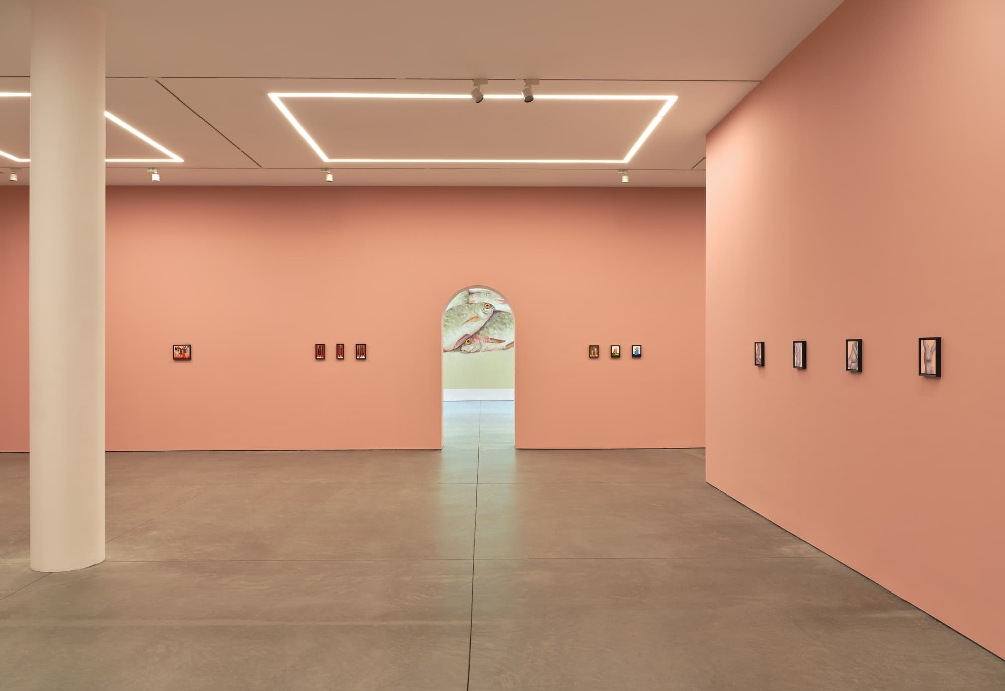
A Review of Nicolas Party's DEAD FISH at Karma Gallery

Nicolas Party's DEAD FISH 

Karma Gallery

Reviewed by Marley Kinsman 

    After nearly two months of consecutive gallery visits there is one exhibition which still sticks with me- Nicolas Party's Dead Fish at Karma Gallery. In an effort to create something thrilling, something never before seen, artists lose their sanity and often end up painting an entire canvas one color. A self proclaimed "masterpiece", which is, in my opinion, garbage. Nicolas Party however, is bringing something refreshing to the table through reproducing not only paintings by the masters, but his own previous works as well.

The archway into the room and the limited view of his huge mural on the back wall draws the viewer into the space, and the sudden YET SUBTLE salmon pink walls are a shock to the eye. It feels like stepping outdoors into the light after being in a dark room for hours. One easter egg I noticed was the fact that if you take an image on a phone, the pink fades away. It is a phenomenon you can only experience in person. This is a unique way to create something you can only view in its fullest in person, like in Renaissance days.

This show is one of the most successful galleries featuring reworked and/or archival media in a long time. Party’s research and methodology is thorough and concise, creating not only a meaningful project but also just a beautiful selection of work.


Nicolas Party: Dead Fish - The Brooklyn Rail

Sunday, March 8

Review of Studio Museum

    The now-reopened Studio Museum in Harlem has a massive array of artwork spanning medium and time. When you first enter the museum, you are surrounded by beautiful portraits by prolific artists such as Gordon Parks to Deana Lawson, looking down upon you in the salon-style hang. However, what the Studio Museaum has in specialty of artworks apart of the collection, it lacks in the quality of presentation. 

    I have never before thought that an artwork looked better online until my visit to the Studio Museum. After viewing Carrie Mae Weems' Untitled (Black Love) triptych, I could only say I was disappointed to finally see one of my favorite artworks in person. This amazing triptych features high-contrast deep-black silver gelatin prints; however, the glass used to frame it only veils the image. The reflections created through the mixture of glass and light clouds the image, destroying the tonal range, hiding the subtleties of the carefully made silver gelatin print.

    For a museum with the stature to gather such a spansive infamous collection, I assumed that they would have the resources to present the work better. There are museum-grade glasses made to prevent this one issue, leading me to believe it comes down to an issue of finance. I trust this issue is not from a lack of care, which is clearly present in the curation and grouping of these artworks. Highlighting a sense of community and appreciation that the museum is clearly striving for.

    -Lewis James


Friday, March 6

Review of Lotty Rosenfeld's Disobedient Spaces


   The Wallach Art Gallery at Columbia University’s show “Lotty Rosenfeld: Disobedient Spaces” is a retrospective of the Chilean activist-artist’s work. Archival documents are presented with photography, drawings, and video installations highlighting Rosenfeld’s feminist interventions and her championing of the “No +” movement. The video projections included are the most compelling use of gallery space in varying sizes across the rooms. 

One piece displaying ants crawling up and down a wall in a single file asks the viewer to contemplate “natural” impulses towards obedience and order. Another large wall displays a video of surveillance footage at a bank accompanied by a soundtrack of either erotic or painful moaning playing loudly. The use of sound mixed with this ominous video fills the viewer with an enthralling and sickening anxiety because the cacophony of sound and imagery do not seem associated. Rosenfeld’s video installations convey a terror in the ominous and uncertain nature of their context, and deep discontent with the Chilean government in a manner that transcends historical knowledge because the feelings of anxiety are imparted in the uncertainty of what one is viewing which allows her audience to step into the headspace of the people, particularly the women of Chile who lived in a state of surveillance and anxiety.

The gallery highlights her interventions, and her work with other feminists of color via photographs documenting these events. Lotty Rosenfeld’s retrospective showcases her effectiveness in feminist activism in Chile especially with the birth of the “No +,” which is the movement by the Colectivo de Accosiones de Arte group to challenge the Chilean dictatorship through art interventions. Her video imagery proves to say so much and crowds the gallery space with the anxiety of life as a woman under a dictator’s regime.


When viewing Kathy Butterly’s exhibition High Vibration at 48 Walker Street, I felt as if I
had entered a small garden of flowers. The bottom handmade ceramic cubes resemble stems, while the irregular porcelain forms above unfold like different blossoms. Each “flower” seems to generate its own miniature world, inviting viewers to move slowly through the space and observe the differences between each sculpture.

The colors and textures of the glazes of these sculptures vary greatly from piece to piece, ranging from the ultimate monochrome to richly detailed and complex treatments. Some surfaces appear smooth and quiet, while others feel more energetic and layered.

Rather than casting molds from found objects, Butterly creates her own forms. She pours liquid porcelain into plaster molds and reshapes the surfaces by hand, drawing lines on the three-dimensional. This process allows the forms to feel both controlled and spontaneous. The final looks appear through glazing and multiple firings in the kiln, where the colors and textures gain their final intensity.

The placement of rounded vessels on top of cubic bases creates a visual tension between organic form and geometric structure. However, when this same tension is repeated across many sculptures within the gallery space, the effect is diminished. The sculptures begin to produce regularities. The lower cubes start to read as pedestals, supporting sculptures, rather than active elements of the compositions.

Because the cubic forms at the bottom are relatively small compared to the irregular shapes on top, and the display height is quite low, viewers must bend down to observe the works, making the cubic bases easy to overlook.

Rebecca Ness: Inheritance

      I found this exhibit to be a refreshing homage to life and art culture. As I passed each work I felt as though I was in on the joke, b...